Friday 6 December 2013

My First Magazine Draft...

I have now decided to go ahead and plan put roughly the layout of my magazine front cover, contents and double page spread. I have chose to do it now because I feel confident enough to do so. I think my timing is good because I know I can come back and change it whilst still having documented proof of where I have improved. This is what it looks like so far: 


Research...

Before I start my first draft of my real Font Cover, Contents and Double Page Spread, I did the last bit of research I needed to make sure I fully understood the "Pop" genre, as this is the definite genre I am using for my magazine. This is what I found out:

"What we know of today as "pop" or popular music evolved in American society over many, many decades. Pop music, which accounts for the majority of the music on today's charts, is an eclectic mix of many different styles of music from jazz to country; rock and roll to rap; be-bop to hip-hop. Pop artists such as Britney Spears, Justin Timberlake, Outkast, Madonna, Maxwell, and others routinely blur the lines of these musical genres with their award-winning tunes. These artists push the boundaries of what is considered "cool” and "hip" and constantly re-invent the medium. For this reason, pop music has helped make the music industry a multi-billion dollar a year business, one whose influence is reflected highly in all forms of today's media including film, video games, TV, and the internet. Pop music is also a cultural force that resonates throughout the world, touching people and societies in ways those governments or politics cannot."

I am now confident in being able to start my own magazine as I am now fully aware of the "Pop" genre and what it's all about. I will be able to use this information when I am creating my own magazine because it will keep me on the right track in the design work of it. I will be able to refer back to it if i needed to. 

Drafting And Planning...

As you can see from two posts below, i was working on double page spreads - however they were only templates. Below I have actually designed one using my own titles and text etc. I have tried to make it look as realistic as possible, I think I was quite successful. As you can see  I have kept it simple but decorative. I think the plain background underneath the black handwritten look font make the double page spread look very "Vogue". I think it does look like it should belong in a Pop magazine as it looks pretty and light, it's not too heavy on the eye, I think it is nice to read. The font is bubbly and dun, like the "Pop" genre. The models I have used look very natural, the fact they are laying on grass make them look innocent and peaceful. The dresses are feminine and do not reveal them in a bad way. This task will help me when i draft my double page spread next. I am pleased with the outcome of my work:


Research and Planning...

I am now looking at the type of artist I want to see throughout my magazine. I have been researching the most famous Pop artists: both men and women and come across Cheryl Cole who caught my attention straight away. Cheryl Cole is an English recording artist, songwriter, dancer and television personality. She rose to fame when she auditioned for the reality television show "Popstars".  

She has the exact look I want to have in my magazine. This is because she is fresh faced, natural and beautiful. You can do a lot of different things with her face. For example she suits any sort of clothing and make-up too. I think she really represents the "Pop" style and genre. Here are some photo's I have collected of her to show you the sort of look I will want to try and get across in my magazine:


Friday 29 November 2013

Research and Planning...

Here I have designed 3 Double Page Spreads. Because I have done a lot of research and work in general on the other features of a magazine,  I though I should focus on creating something different. From creating these double page spread templates I have found out what sort of look I want my own double page to look like when I come to create them. I think the type of models I have used on all three are unique and different. The effects I have used to make the photo look chic and fashionable have worked well; If they were real I think they would attract a lot of attention. I have tried to make all three look different in their own way, whilst trying to make them similar to show they are all from the same genre of music. The models I have used all look natural and beautiful, I think this rules out the possibility of the audience thinking they are heavy metal/grunge type artists (See post below on annotations of different styles of music). I am pleased with the outcome of all of these double page spreads:


Friday 22 November 2013

Research and Planning...

Here i have analysed different pictures of both girls and boys to demonstate my understanding of them. I have shown through my annotations that i know what type of person/look/style to use on different magazines. This will help me when i come to design my magazine, contents and double page spread:


Tuesday 12 November 2013

Progress and Alterations...

As you can see from my last post, i designed a magazine front cover, contents and double page spread. My improvement from my teacher and my peers was that it wasn't obvious that it would be "Q" magazine from the type of model used. I have designed another front cover of a different genre of music to show that i have thought about this improvement and put it into action.What is also beneficial from thee improvements is that it will help in the near future when i create my final piece. Here i have demonstared that i can match the type of model i have used to the type of magazine i create.
(I haven't used original photography as i used it last time and wanted to explore the internet in order to find a model/models who present the look i want in my magazine...) 


This is the final result:


Friday 8 November 2013

Planning Work...

After creating my Q magazine, I found this photo that I didn't use. I think it is an effectual picture and i have annotated it to explain why.This will help with my planning, I can look back on this and maybe gain some inspiration from it and/or look at ways to improve it for when I have other photo's.


Sunday 3 November 2013

Remake Remodel...

For this task I have chosen an existing magazine and created a front cover, an contents and a double page spread in the style of my chosen magazine as this is what I'll be doing for my final assessment. In this case, I used Q magazine and came up with original photography, cover lines, fonts and topics in which I thought would suit the magazine itself; below are the three pages I used for inspiration and you can see how my ideas are similar. This task will help me in the future when I come to design my own magazine. I will be able to refer back to this as a part of my planning to gain ideas and know what my own magazine should include. This has also helped me to practice creating magazines using my own original photography, also benefiting me for future tasks. 

Here are the three pages I used as inspiration for the ones I create which will also follow below:


Now, here are the three pages I created by myself which have been analysed:


Friday 1 November 2013

Research and Planning...

Because my chosen genre of music magazine is "Pop", i decided to look into the biggest pop magazine "Billboard" and have a look at what their producers have been doing to make their magazine's stand out. I have also done some research into the codes and conventions of magazines. This will enable me to make sure my magazine will look realistic and professional. This is what i found out (in my own words):
I believe most of these codes and conventions should be used to make a successful magazine cover, contents and double page spread...

Masthead: This is the title block for the magazine, usually this is the most eye catching convention on the page. The masthead always has to be distinct.

Menu: The list of contents inside the magazine.

Pugs: These catch the readers eye as they are well placed. A pug is to the top left hand and the top right hand of a magazine. The prices and logo's are placed here.

Secondary lead: A sneak preview of an inside article or story, this would usually be a picture.

Sidebar: Additional information usually in a box next to the main feature of a magazine.

Splash: This is the main story of the front page, accompanied with the headline and a photograph.

Spread: A story that covers more than one page.

Stand first: A sentence after a headline and before an article begins that sells a feature to the reader.

Strap line: Also known as a sub heading.

Tag: Categorizing the readers attention and interest in a story by using a word or phrase to engage them.

Box out: A colored box behind some text to make the text itself stand out.

By line: Name of the reporter.

Caption: The text underneath a picture which would explain what is taking place in it.

Credits: Mentions to whomever is the designer of certain things.

Cross head: A subheading shown in the body of the text and stands out. 

Kicker: A story designed to stand out above the rest. Usually presented first on the front cover and then in the contents.

Lead story: Usually a splash, this is the main story.

I analysed these different covers with big pop stars on the front of them. I will use these examples as my inspiration:


Saturday 19 October 2013

Experimenting With Photographs...

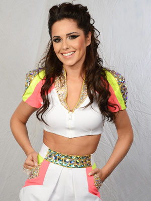
Recently I have been looking at the different photographs included in magazines, especially the photographs featured on the front page, contents and double page spreads. What I have noticed is that they are edited; some photos are in black and white, some only have things like lipstick and hair in colour etc. Because I want my magazine to look professional and realistic I have decided to practice editing photographs. This will help me for when I come to create my actual, final magazine cover, contents and double page spread. I have practised editing the photograph below using Paint.Net which will be the programme I create my magazine with.

This was the first, original photograph taken.
This photograph was not edited in any way:


I doubled the image by flipping it 360 degrees. I then turned the brightness down. This made the features look darker; especially the hair, eyelashes, t-shirt and lipstick. This would be beneficial when on a white background as the picture will look vivid, bright and very clear.


I then decided to change the colour into black and white. I think this looks very chic and classy, I think it would look very effective on maybe a very busy background, this is because it would have such a contrast. Black and white is quite old fashioned and vintage. However it can also look edgy and rocky.

It turned out very useful in practising different editing techniques on Paint.Net, I am happy with these edits. I will carry on exploring the different effects after completing some more research.
I think the last magazine post I uploaded (MRW); the photograph could of been a lot better, that;s mainly why i made the decision to experiment here. This will mean that the next draft magazine I create, the photograph will look a lot more professional and realistic.

Friday 18 October 2013

A First Attempt At A Music Magazine...

From the ideas and research i have developed so far, I decided to try and create the front page of a Pop Magazine. This is how it turned out:


I have created this as part of my planning and I am very pleased with it. I used the Q magazine below featuring Cheryl Cole as my inspiration, I have stuck to the colours red, white and black which I think are classy and not to bias in the sense that they wouldn't just appeal to either boys or girl. because I thought that "Kirstin" would mainly attract male attention, I included a pull out poster of Justin Bieber to appeal to the girls. I have tried to make the font classy, yet informal and I think it has worked out well. There aren't too many sub headings which would make the magazine cover look crowded and take away the attention of the star who is supposed to be the main focus. I have used the left third to my advantage and I think it has paid off. Although I could improve the photograph in regards to editing I am pleased.


I have also created this Contents page. I have tried to keep the same colour scheme as the front page to keep it realistic although I have used a spot of yellow too to attract the attention of the readers and a matte grey background to make everything on it stand out and look almost 3D. I think it looks quite realistic although I could do more in regards to to the quality of the images, I could try next time to crop around the edges rather than keeping them rectangular. Overall I am pleased with the end result but I understand that there is a lot still to be done to make it look better and professional.


I have also created a double page spread as this is what i will be creating when i have finished all of my planning etc. I am happy with this double page spread. First of all, it relates to everything on the cover and contents so it is realistic in that sense. I have used the colours pink and blue for two reasons. Number one is because: pink mainly attracts the attention of girls and blue the boys. I also used these colours because the pink matched Kirstin's lipstick and the blue matched her top. I think this made the spread look more professional and thought about. Although there is no red on this page like on the front cover and contents i have still used black. I think this gave the magazine a bit of change, because looking at the same thing over and over again can become boring and uninteresting and my aim is to keep the readers attention. There are things i could do to improve such as crop the photo around the actual outline of the model and work on the background so it doesn't look so matte but over all i am pleased with my first draft.

My Music Magazine Development...


As i am developing my ideas for my magazine further, i have been doing some research on the type of people big in music in today's society. The first result which came up on the internet was YouTube sensation Justin Bieber. Justin Bieber became famous in 2004 when his home made music videos went global. Justin Bieber is 19 and appeals to teenaged boys and girls - especially the girls. I think a character like Justin Bieber would look effective on the front of my magazine. He is young, stylish yet smart and good looking; he is cleanly shaven and looks sophisticated. I will use Justin Bieber as inspiration for my modelling shoot, in making said model look similar. 


According to Google, and my personal opinion, Lady Gaga is the biggest female Pop artist this year. Because my magazine will be based around the "Pop" genre, i think it's beneficial for me to use Lady GaGa as inspiration. Not only does her music pretty much always top the charts, she has a unique style that appeals to teenagers. As well as that, she is very beautiful which attracts the attention of boys. Lady GaGa is one of a kind and i like her style. I will keep this in mind when i use my female model for the front of my magazine cover. The black she is wearing above looks seductive - this has been done on purpose. I especially like the eye make up used just under her actual eyes. I will keep this in mind also when using my model. I think it is something different which would look effective on the front of a music magazine.

Peer and Self Assessment...


Assessor: Myself:

At the moment, i have completed all tasks that have been asked of me and i will keep on top of everything else i am asked to do in the near future. i am really enjoying uploading relevant things on to my blog. I think the tasks I've done so far look realistic though they are not 100% there yet but this is reasonable because i haven't really had all the practice. I especially like my magazine covers i created a week ago. I had a lot of fun making up the headlines and putting different pictures of bands and famous icons.On the other hand i think they could of been better. A target for me for next time will to be add more sub headings as i don't think there were many and i had noticed i hadn't included date lines on 3 of them - datelines are crucial to a magazine else without them they won't look realistic. I plan to use these in the future as a template of my own magazine which i will create.

Peer Assessor: Molly McDonald:

I think this blog is full of different research and tasks. It looks organized and well structured - it's also very enjoyable to look at and read. i can see that all of the tasks have been completed to a very high standard although the magazine covers created a week ago could be improved slightly just to make them look more realistic - though i think they look effective too! i think all of the tasks completed by you look great, you have done some good work so far keep so keep it up! 

An Inspiration Post...

As I have been doing research into my music magazine, looking for ideas and inspiration; I'm creating a "Pop" music magazine intended to attract teenagers both boys and girls, I have been looking at different music magazine covers which could potentially inspire me, so I could use some of their ideas and copy them or make them better if possible. I have come across these music magazines which really caught my attention for different reasons:


Here is another analysis of a complete different genre. Kerrang! Live life loud is a rock magazine. I analysed the codes and conventions to see if they were similar to the Q magazine.


Target Audience Research...


Because i am now starting to really gather my ideas and develop an overall idea about my music magazine I'm going to create, I've started collecting a lot of different information. One of the most important aspects of a magazine is the target audience you are aiming the magazine at. I have researched a lot about my decided target audience which is teenage boys and girls. Here is the information i have found out from different websites on the internet:

Through research i have found out that statistically in general the most popular genre of music liked by both (teenager) boys and girls is pop music (popular music) i.e: music in the carts, UK top 40 etc. Pop music is usually played on different radio stations like Capital, Radio 1, Radio 1Xtra etc. Being a teenager myself i think it will be beneficial for me to do a magazine targeted at teenagers too. I have decided that the genre of my music magazine will be Pop. From this, I have also found out that: 

"Pop music (or "pop") is a sub-genre of contemporary popular music that typically has a dance-along rhythm or beat, simple melodies and a repeating structure. Pop song lyrics are often emotional, commonly relating to love, loss, emotion, or dancing. The term does not refer to a single genre or sound, and its meaning is different depending on the time and place. Pop music is distinguished from classical (or art music) and from folk music. Pop songs are often written by songwriters, unlike other popular music genres, such as rock and hip hop, where singers often write their own songs."

Another important aspect of a music magazine is colour. Colour is usually the most influential factor on the front of a magazine cover to attract the target audience. I have done some research to find out more on colour:
Colour:
Males: 

  • Prefer the color blue to red, and orange to yellow. 
  • Baby boys traditionally tend to be dressed in blue, except in Belgium where pink is used for baby boys. 
  • In the western world many men are color blind so you need to be aware of the red/green visual problems if this is your target market and choose other colors that are not as affected.
Females: 
  • Prefer the color red to blue, and yellow to orange. 
  • Baby girls traditionally tend to be dressed in pink except in Belgium where blue is used for baby girls. 
  • Tend to have a broader range of color preferences to men and are more open to trying new colors.
Both Genders: 
  • Blue, turquoise, green, red, yellow, black, white, gray and silver are colors that are the most suitable for use in a business marketing to both males and females. 
  • Pinks and purples are now becoming more acceptable to males, with pale pink business shirts and purple casual shirts commonly seen on men.
  • Respond best to high contrast visuals.
Adolescents/Teenagers: 
  • More open to experimenting with more sophisticated and complex colors due to their exposure to computer graphics programs such as Photoshop. 
  • More influenced by cultural influences due to multiculturalism and greater access to world markets through the Internet. 
  • Many younger teenager girls love varying shades of purple and pink. 
  • As they reach their late teens they often show a preference for black - this relates to a psychological need for black during the transition stage from the innocence of childhood to the sophistication of adulthood - it signifies the ending of one part of their life and the beginning of another, allowing them to hide from the world while they discover their own unique identity.

Tuesday 15 October 2013

Independent Research...

I have carried out some research of my own and edited a photograph. I'm thinking ahead for my own music magazine and the main convention of a music magazine is to have a main image. I have attempted to create my own magazine style photograph. I think this photograph would suit a more classy, pop magazine rather than a rock, grunge type magazine. This is because of things like the red lipstick, the big curly hair, the subtle eye make up and the general effect. I have edited this photograph on a programme called "Paint.Net" which i will be using when i come to create my music magazine. I thought i would practice myself and gain a few more skills. I have used different features of Paint.Net like cropping, color edits, double photo effect, lighting adjustments and put it on a white background which brings the main picture more vivid. I have enjoyed doing this task on my own and after it i feel a lot more confident with the software programme i will be using to create my assessed music magazine in the near future.

Friday 11 October 2013

Improved Magazine Cover and Contents...


I have created a new magazine cover and contents page after doing some more research on things like: codes and conventions, good and bad features and typeface. This has helped me in the sense that i know a bit more about the front covers of magazines and contents pages. I think this cover and contents is better than my first attempt because: I've used red, black and white which are the school colours (which were preferred by the people who filled out my questionnaire), i have made the text smart and sophisticated which suits the genre of the magazine being about school but made it stylish at the same time which would appeal to my target audience of pupils and teachers. I have used many more photographs from around school and added more subtitles; the subject of them being something to attract the reader. I am pleased with these two pages i have produced however i am looking forward to learning more and improving upon this again. Watch this space!

Thursday 10 October 2013

Magazine Cover Designing Task...


Here i have uploaded 5 magazine covers. I've added the appropriate codes and conventions tot he five templates including things like font and language techniques. This has been great preparation and practice for when i start making my own music magazine.

M - Drake: I have tried my best to make the front cover of this magazine look quite Hip Hop and Ghetto like. Drake is a rap sensation and mainly appeals to teenage boys/men. To appeal to this target audience i have included a picture of Rihanna who would appeal to the boys/men especially a free "pull out poster" would attract them to buy it because she is a big sensation and very beautiful too. The font on the front cover looks very informal. It is also easy to read. 

M - The Rocky Roaders: I have based this magazine around the 90's. To fulfill this theme have used a lot of different colours such as red, pink, green and blue i think this stands out and would attract the readers in. The font is bubbly and fun like the 90's. The fact it is a limited edition would attract the readers attention so they would know its a "one off" copy. 

Music_X - Bjork: I have kept this music magazine front cover very plain. I have only really used the colour of white on this cover. This is because i think the person on the front cover looks quite mysterious and the white is connotative of things like ghosts.

Pitch - Marilyn Manson: I have used a Gothic  blood like font in the colour red as the colour red connotation is death, blood and gore. I think this suited the magazine theme because the artist on the front cover is a Gothic artist. This would appeal to the people who liked that sort of music.


Sound - Kings Of Leon: I have kept the font quite edgy and rocky but not too much rocky and edgy because of the type of band Kings Of Leon are. I've mainly the used the colours white and red because the connotation of them is pureness and passion, like how the bad are they passion about their music.