Wednesday 26 February 2014
Sunday 23 February 2014
Saturday 15 February 2014
Wednesday 12 February 2014
Planning...
This is my model, Chloe Blagg. She is my sister and I think she is ideal to use as the main artist of my magazine. This is because:
- She has a natural face meaning you can d o a lot of things with make up and effects
- She has long blonde hair which is wavy, this looks natural and I can work with it in different ways
- She represents the "Pop" genre well
- She has no piercings or tattoos (this is something you would expect to see on a Rock magazine
- And she is tall and stands out

Planning...
As well as touching up a few of my techniques which I have learned over these past few months, the magazine cover I have made below has made me realize that I want to change the name of my magazine. I don't think "M-You-Sic" although sounds and looks good, I don't think that it really gives the genre away. I like the name I come up with previously which was "Clarity". This is because I think it is striking and looks and sounds different.
Below I have typed up different fonts I am looking to use on my magazine cover and throughout my magazine for titles, subheadings etc...

Planning...
Before I now to start to produce my first draft of my front cover, double page spread and contents I have decided to my practiced techniques to use. Here I have made a random magazine cover where I have tried my best to use all of the codes and conventions I have studied.
This has really helped me gain that last bit of practice I need before I make my official magazine:

I think though, that when I come to make my own, it will look a lot more "chic" and "elegant". I think I will tone down the colours just a little and make them coordinate. I am pleased with this overall though.I particularly like the font and the title "Clarity". I'm thinking about changing my magazine name to this because I think it is striking and the meaning of the word is in fact appropriate to a Pop Music Magazine.
Friday 7 February 2014
Support Artist last minute work...
These are some more photo's of my support artist, Saskia. These were shot in an alley way. I think these shots look preppy and pretty. The red lipstick is very distinctive and stands out. The snap-back looks cool and casual. I am pleased with these shots and I might use them on a collage on my front cover and contents. I am pleased with these photo's.


Wednesday 5 February 2014
Sunday 2 February 2014
Finalisations...
Here are the two final photos that I have taken myself of Saskia, my support artist. These are the two photos I will use in my final magazine. I am happy with them because I think they look professional.
I dressed Saskia up to look very glamorous. I made sure all of her body was covered up also so nothing was revealed (the jacket coming off her shoulder adds effect)
Her make up is subtle but stands out and I've curled her hair too so she looks natural - this is important because I did a lot of analysis of how a normal Pop star is represented. I know that I have took that research on board when shooting Saskia.
I think the location was a great place to shoot as well because it's modern (and pink) I think this will attract the audience and give the magazine a sense of realism.
I'm glad I have this sorted because now I can focus on my main artist as this is the most important and vital for my magazine.


Tuesday 28 January 2014


Wednesday 22 January 2014
Modelling ideas...
This is my support artist, Saskia. I've took a few photos of them to give you and me and idea of what she looks like and what the pictures look like when they're featured in and on my magazine:
I may not use these on my final magazine but I've taken these for development and practise.
Saskia:


Friday 17 January 2014
Codes And Conventions Of Music Magazine Front Covers...
I decided to research and refresh my mind on the codes and conventions of a magazine front cover as I haven't really gone into detail about it. This is what I found out:
(I will also do this for contents pages and double page spreads)
- Most music magazines have a colour theme of 3/4 main colours, these colours are usually from a limited range as this makes the magazine stand out more to its audience.
- The masthead is at the top of the page and it's main job is to draw in the audiences attention as it suggests the genre and target audience, for example a children's pop magazine like "Smash Hits" has bubbly font which appeals to children.
- Buzz words are used in order to attract attention for example "plus" and "free", these words both get the reader to want to buy that magazine.
- Around 5 cover lines are used which also link/relate to the genre of music.
There is always a main image used which is of the main band or artist, when it is a band it's usually a long shot however when it is a solo artist it is usually a mid shot unless it is a solo artist who is looking at the camera in order to connect to the audience where their body language reflects this audience and the genre of music.
- Subsidiary images are used which may also get you to look at the magazine, especially when well known images are used. These images may be used as a back up if some of the others do not appeal to the audience.
- There is an organised layout which suggests a more mature audience as it is formal, this is then appropriate to the genre and the target audience an example of this is Q magazine as it looks more serious.
- A tag line is used which also is there to attract attention and give the magazine an edge for it's audience.
- There is also normally a plain background used as this makes the other features of the front cover stand out more and make it look more formal.
- Basic information is also featured on the front cover; which is needed for most magazines in general like a bar code, price and issue date. If the magazine is more expensive then this price tends to be smaller so that it isn't the first thing the audience see and get put off by. On the other hand if the magazine is cheap then the price is usually bigger and bolder in order to quickly draw in the audiences attention.

Using My Inspiration...
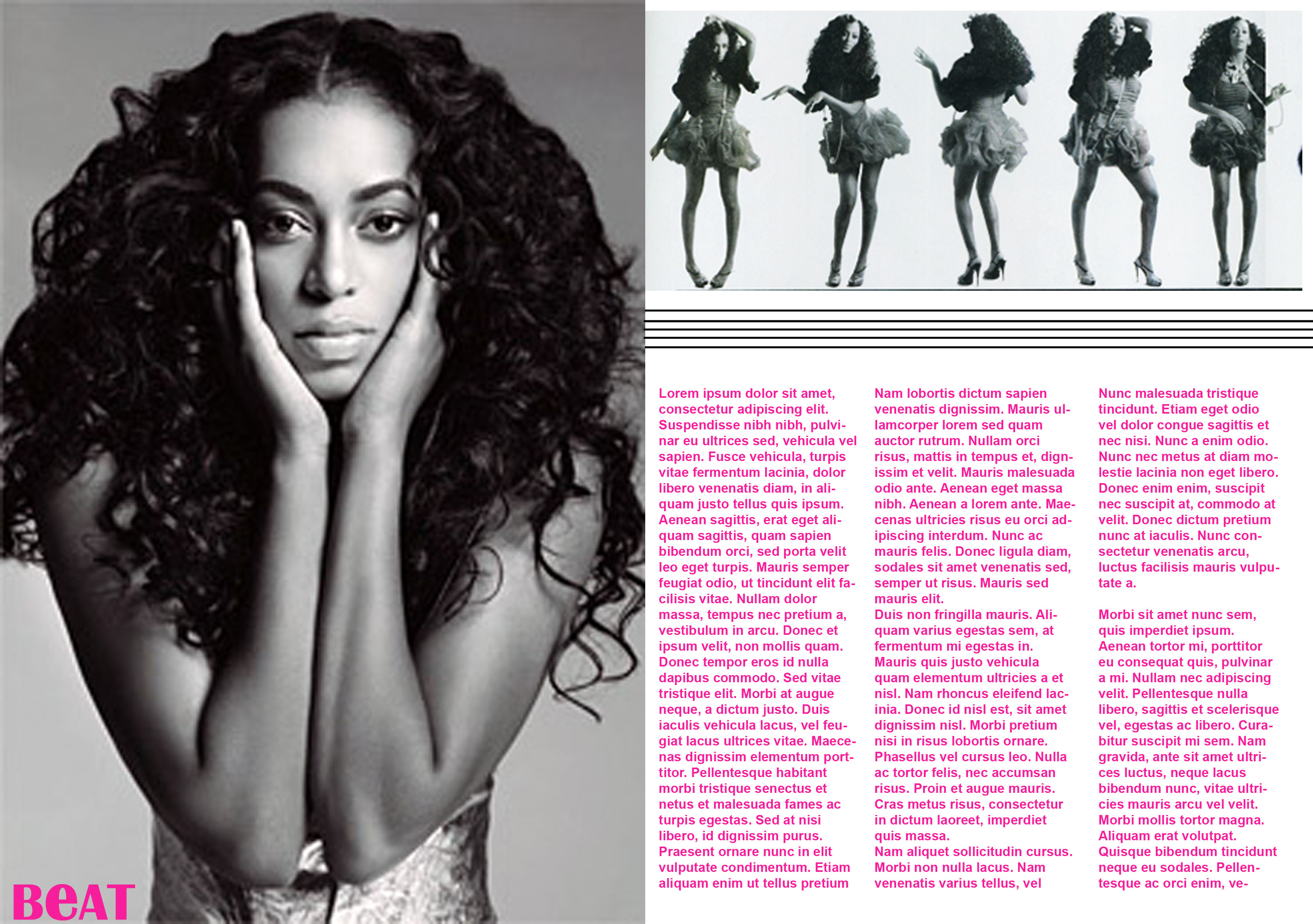
Because I've just analyzed the double page spreads below and said I would use them as my inspiration, I've decided to create one as a draft. I am pleased with the result of this double page spread. This is because:
- I gave used different elements from the initial double page spreads below i.e. I have used a big letter for effect.
- I kept the black and white font theme which makes it easy to navigate and read; there aren't any distracting colours or "too much going on".
- I've used 4 different pictures using one main one. I think the 3 little sequenced pictures look good and professional. The audience are given more of an insight into the artist because of this.
- I've used different quotes which would be in-bedded in the content of the double page spread. These quotes are the ones of most significance and show the audience what is available to read inside.
- My main artist is fresh faced, natural and looks elegant which fits the "Pop" genre perfectly.
This is what it looks like:
(Obviously the word "content" would be replaced with actual words)

Further Double Page Spread Analysis...
Moving on from the AS Student's work on Double Page Spreads, I've decided to look into real music Double Page Spreads and analyze them to use them as inspiration:
I like this Lana Del Rey double page spread featured in Q Magazine. Although this magazine is created for and Alternative type of music, I can still use the ideas from it to suit it to my magazine. What I liked most about this is the simplicity. It's so plain and simple but still really stands out. The black and white font looks classy and elegant, it is also easy to read. I also like the photo of Lana Del Rey. There has been an effect put on it to make it look darker and there is circle shapes surrounding the edge of the photo. This contrasts with the elegance of the text as she looks mysterious and seductive - especially because she isn't looking into the camera, she is looking towards the ground. I The giant "S" shape also adds effect too. I will try and create something like this because i think it looks really unique. This is what the double page spread looks like:

Double Page Spread Research...
Because I have done a lot of studying and analysis of Front Pages and Contents and what looks effective etc. I have decided to look into different double page spreads and what I would like to use as inspiration for when I come to create my own.
I have come across these two double page spreads that have been created by an AS Media Studies student like me. I think they look really professional and effective because:
- The font is really small and there is lots of it so it looks realistic
- There are different pictures of different sizes which attract the attention of the readers
- There are different quotes around the page to look at and read
- There is no negative space
- The colour scheme is effective because it is classy and easy to read
- It's simple so there isn't too much to take away effect of the main content
These are the two from AS Study Students that I will use for inspiration:

Thursday 16 January 2014
Photograph Editing...
Taking on board what I said previously about making my magazine have special effects around the main picture of my main artist, I have practiced doing them myself. This is just an ordinary picture of me edited to look distorted and unusual. I have added different shapes and colours of hearts to give it a Pop Electro effect:

I like this because it looks different and looks like it should be on the front of a magazine cover which music genre is Pop. I will do something like this on the front cover, contents page and/or double page spread to add effect and catch the eye of the customer. I think it's important to make a magazine look different because there are so many of them in general so you have to make your own stand out so people but it over anyone else's. I am pleased with the outcome of this editing.
Magazine Content...
I have already blogged about my support artist, Betty Perry. After looking at different Pop magazines, i have spotted one young lady called "Marina" who took my attention straight away. This was because she looks so much different to all of the other Pop artists i have seen. I said previously that i wanted Betty Perry to have a different edge; this is why i am using Marina as inspiration. This is here and the sort of look i will give Betty Perry:


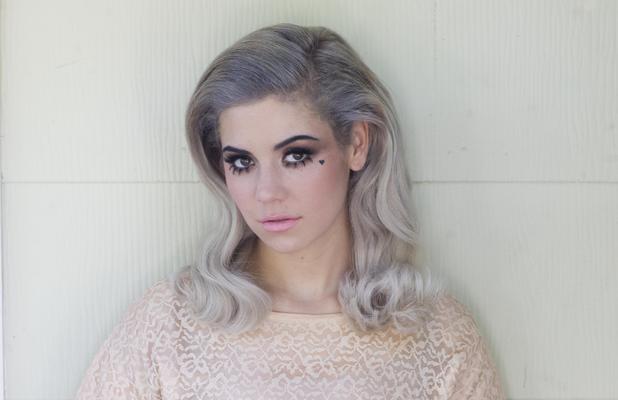


Her look is almost old fashioned, but modern at the same time. She looks very natural whilst wearing make up. I think her style is different and outgoing, like i want Betty Perry and her personality and music to be. You can tell the sort of music she would produce is Pop through her style and smiles. This is her posing on magazines:


Magazine Inspiration...
Because I am creating a Pop magazine, I thought it would be beneficial for me to look at other magazines that are sold within the Pop genre segment. These magazines below are the ones i personally found most appealing and will use for my inspiration:


As you can see, these magazine covers all have similar colours. I like the bright colours as they take my sttention away straight away. All of the artists featuring on the front cover are fresh faced and beautiful. They all have little effects added on to them as well like for example: flowers and little hearts drawn on their face. I want to do something like this on my main artist because i think it's unique and different.
The magazine covers in general look effective because they aren't particularly cramped and over full with different details. You are aware of the main story inside and still informed about other articles that will be inside without being overwhelmed with everything on the page. We are able to see, especially on the first image, what is available for us to win - everyone loves a good competition! I think these really are ideal Pop magazines for me to use.
Magazine Content...
I am obviously going to have a support artist in my magazine to appear on the front page in the corner or something, and on the contents page as well. I am going to use a teenage girl who's coming to the end of her teenage years, this is so her beauty looks more mature, attracting the girls to my magazine. I am going to call my support artist Betty Perry. This is because I think it sounds fun and energetic, it's a girls name that sounds like it has a bit of an edge. I think it is also unusual. I'm thinking it will look similar to this:

I think this looks really effective and attractive because it almost looks like the name in lights. This conveys importance which is beneficial for me and the magazine because it looks professional etc. Obviously I will try out a number of different fonts to see what I prefer but I think this a very good start.
I am also using this girl below to model and actually play out Betty Perry. This is because I think she has the innocent but attitude-y look that Betty Perry has. She is naturally beautiful which means I can experiment with her make up and hair too. She has a lot to offer and I think she will represent my magazine in the best way possible:
(In this picture below I defined her eyebrows with eyebrow pencil and her lips with a fuchsia colored lipstick, i have also curled her dark brown hair to make her look like she has an edge, it isn't just plain and simple - this is just one example on how i can make her look different to suit the genre of my magazine.)

Target Audience Research...
I have been doing a lot of research in previous posts about what sort of people I am trying to attract to my magazine (Teenage girls). I have provided some photo's underneath to give you an insight on the type of people I am trying to attract to buy my magazine:


As you can see, these look like happy, naturally beautiful, outgoing girls who are obviously in their teenage years. I want to attract these type of people to my type of magazine as they stereotypically look like the type of people who would be interested in reading things about Pop music, stars and gossip.
Preparation...
I've been updating my last posts. I am now starting the preparation for my first official draft magazine cover, contents and double page spread. I'm first going to look at and come up with a Magazine Title. Here are some of the ones I have come up with and reasoning:
TOP OF THE POPS
POP MUSIC
POP PEOPLE
PARTY MUSIC
WICKED
BAM
DOUBLE WHAMMY!
SWEET 'N' TOXIC
LOOK!
THE BIG TAKEOVER
CLASH
M-YOU-SIC
POP EXPRESS
MRW

Out of the list above, these are my favourite three - all in different fonts. Because my target audience is for all young people that may like Pop, i think now that "Sweet 'N' Toxic" sounds too girly and would maybe put the male buyers off. I think MRW (Music Review Weekly) sounds quite plain, it doesn't have anything about it really. It's not something you would particularly remember in comparison to "Sweet 'N' Toxic". My first choice is definitely "M-YOU-SIC", although it doesn't really give away what type of genre it is, the front cover will give this away anyway. It will be pronounced "Music" like normal, but it looks different and unique so i think it will catch people's attention and they will always remember it. The "You" in the middle conveys the music will be based around what they want. I am pleased with this title. I have decided that this is the title I am going to go ahead with.
Subscribe to:
Posts (Atom)