Because I have done a lot of studying and analysis of Front Pages and Contents and what looks effective etc. I have decided to look into different double page spreads and what I would like to use as inspiration for when I come to create my own.
I have come across these two double page spreads that have been created by an AS Media Studies student like me. I think they look really professional and effective because:
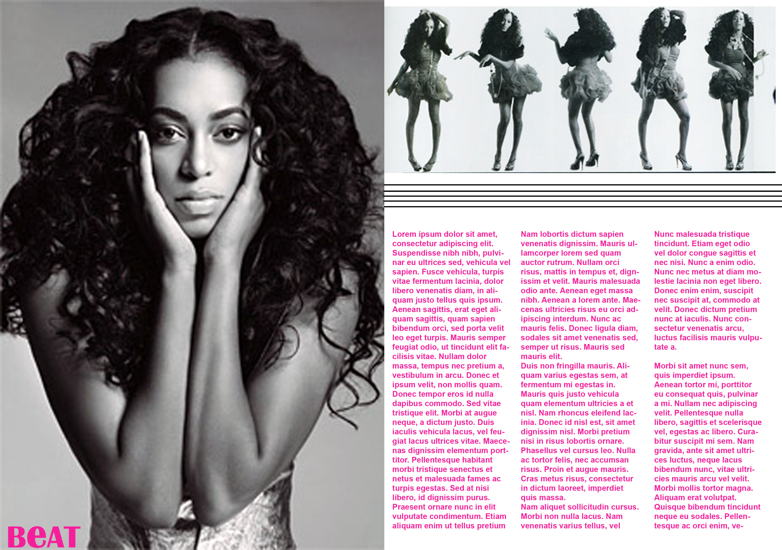
- The font is really small and there is lots of it so it looks realistic
- There are different pictures of different sizes which attract the attention of the readers
- There are different quotes around the page to look at and read
- There is no negative space
- The colour scheme is effective because it is classy and easy to read
- It's simple so there isn't too much to take away effect of the main content
These are the two from AS Study Students that I will use for inspiration:

No comments:
Post a Comment